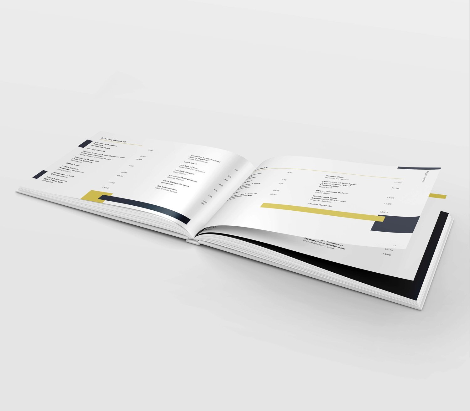
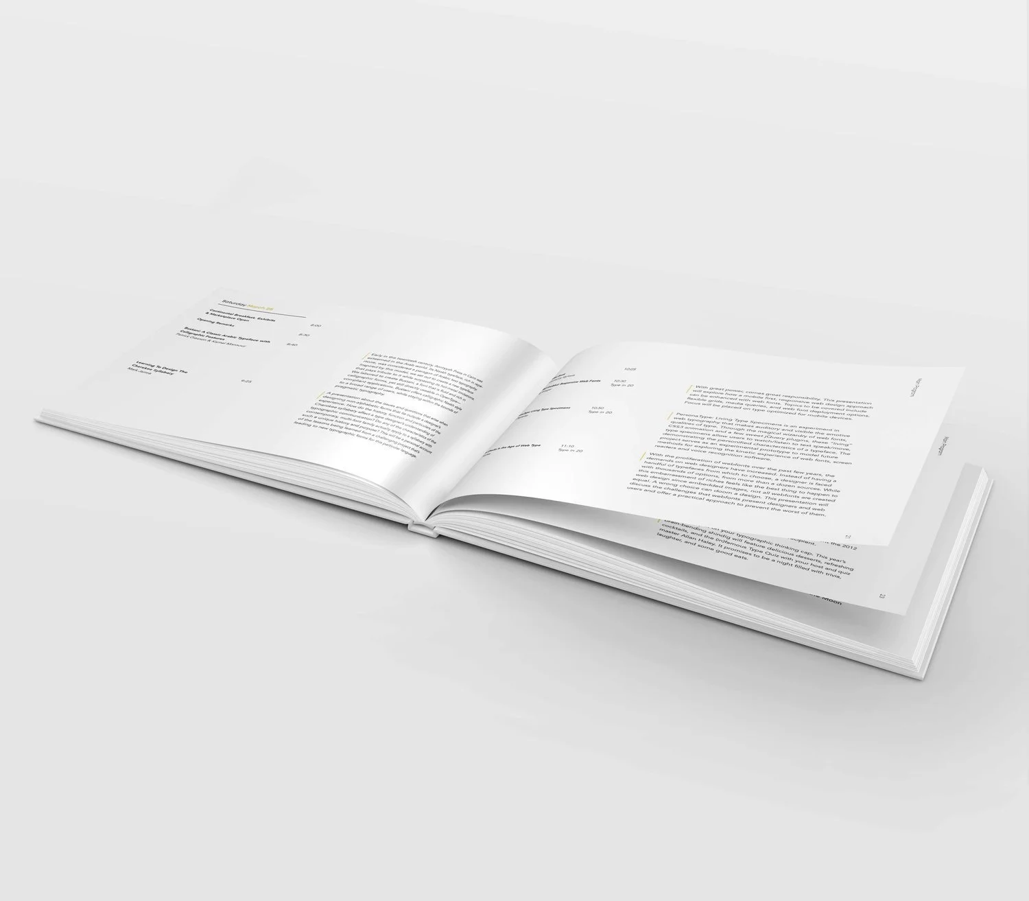
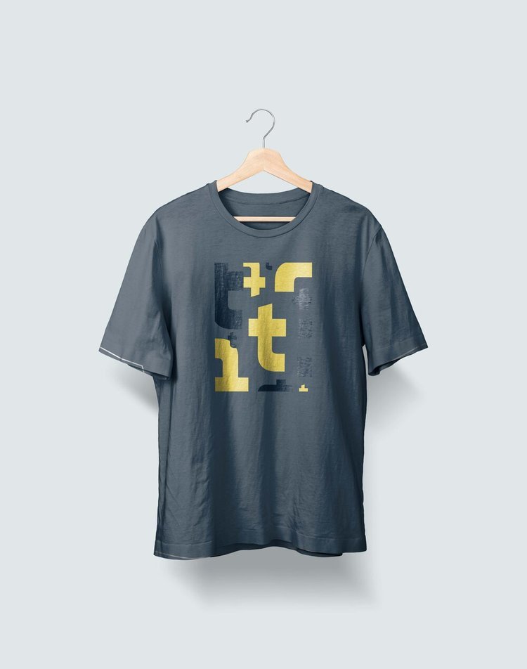
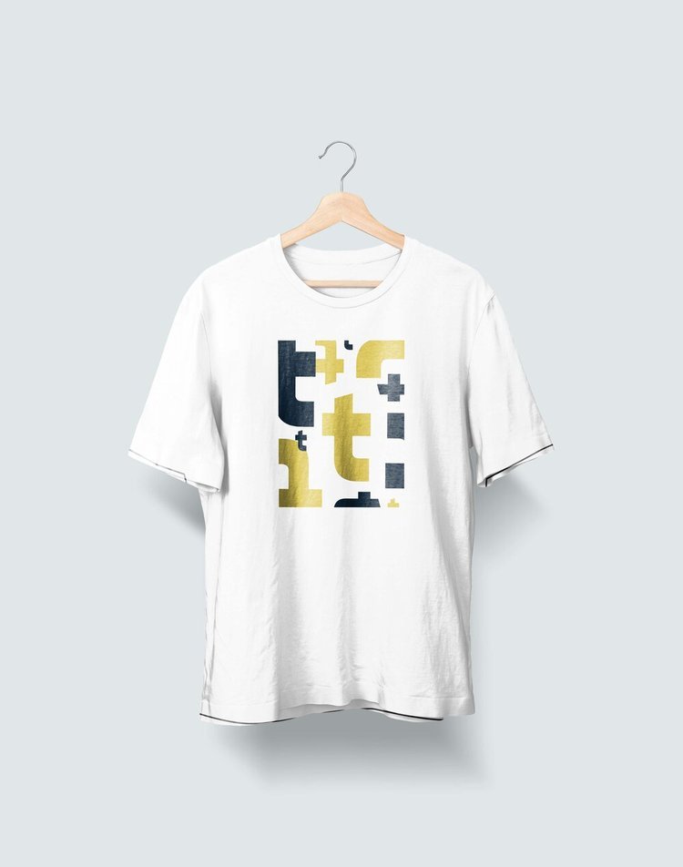
Typotecture Conference
A design concept for a conference dedicated to graphic artists who specialize in all things type.
identity system
type setting
print design
Does Type Have Boundaries?
Typotecture was a fictitious conference held in London, England, focusing on the intersection of architecture and typography, particularly in museum settings. Typography plays a crucial role in the success of any exhibition. It can truly come alive in a museum, whether it's displayed on a wall or presented as a small caption beneath a piece of art.
During this project, I explored typography from a three-dimensional perspective. How would type appear if it were treated as building blocks, walls, or hallways? What similarities exist between typography and architecture? I observed that both fields require various components to create a cohesive final product. For instance, letters must be combined to form words, and those words must be organized into ideas. Similarly, architecture involves the combination of materials like wood, cement, and hardware to construct a finished building. Typography has the potential to be transformed into anything if given the opportunity.
“Words have meaning, and type has spirit.”
—Paula Scher
Inspiration
The Met + MAXXI | Museums
During my study abroad experience, I visited numerous museums across Italy, from modern art galleries to centuries-old churches. Despite their differences, they all shared stunning shapes, depictions of angels, and intricate dimensional spaces.
Being exposed to thousands of years of architectural history enabled me to appreciate typography in a three-dimensional context.
Paula Scher | Graphic Designer
An American graphic designer and painter with significant prominence in the design world. She sees typography as a living organism that we can interact with daily.
Typography is an art form that often goes unnoticed by many, as effective type design allows viewers to engage with the content without being consciously aware of the letterforms themselves.
Bjarke Ingels | Architect
A Danish architect who specializes in designing housing complexes. His work is characterized by bold geometric shapes that harmonize with nature. Each project considers the surrounding environment and the human experience, reflecting the ideology underlying this initiative.
In this context, letterforms are designed to resemble architectural elements, emulating hallways, as seen in the book. Inspired by Ingel's work, I aimed to create a brief that merges the physicality of building materials with the essence of typography.


Fonts
Gopher
reverse contrast | geometric font
Avenir
an organic interpretation of geometric fonts


